Design guideline
Overview
This guideline provides a comprehensive framework for companies and organizations integrating their health devices with our digital platform. By following these design principles, you can ensure a seamless and user-friendly experience for your customers while leveraging the full potential of our technology. Our goal is to create a consistent, intuitive interface that aligns with your brand and optimally engages end-users. This document outlines the essential components for designing and customizing screens within our platform, including:
Consistency
Adhering to established design patterns for a unified user experience.
Integration
Providing clear instructions for incorporating your device data with our system.
1. HeaderThe title is a concise text that highlights the most important information or step within a section. 2. ImageA visual representation, such as a photo, illustration, or diagram, used to clarify concepts, demonstrate functionality, or provide context. 3. TitleA secondary text providing additional context or a brief explanation of the title. 4. Body textClear and actionable steps that guide the user through a process. 5. ButtonInteractive elements that trigger actions when clicked or tapped. | 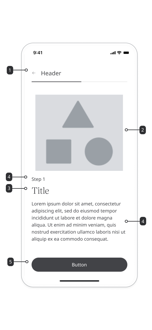 |
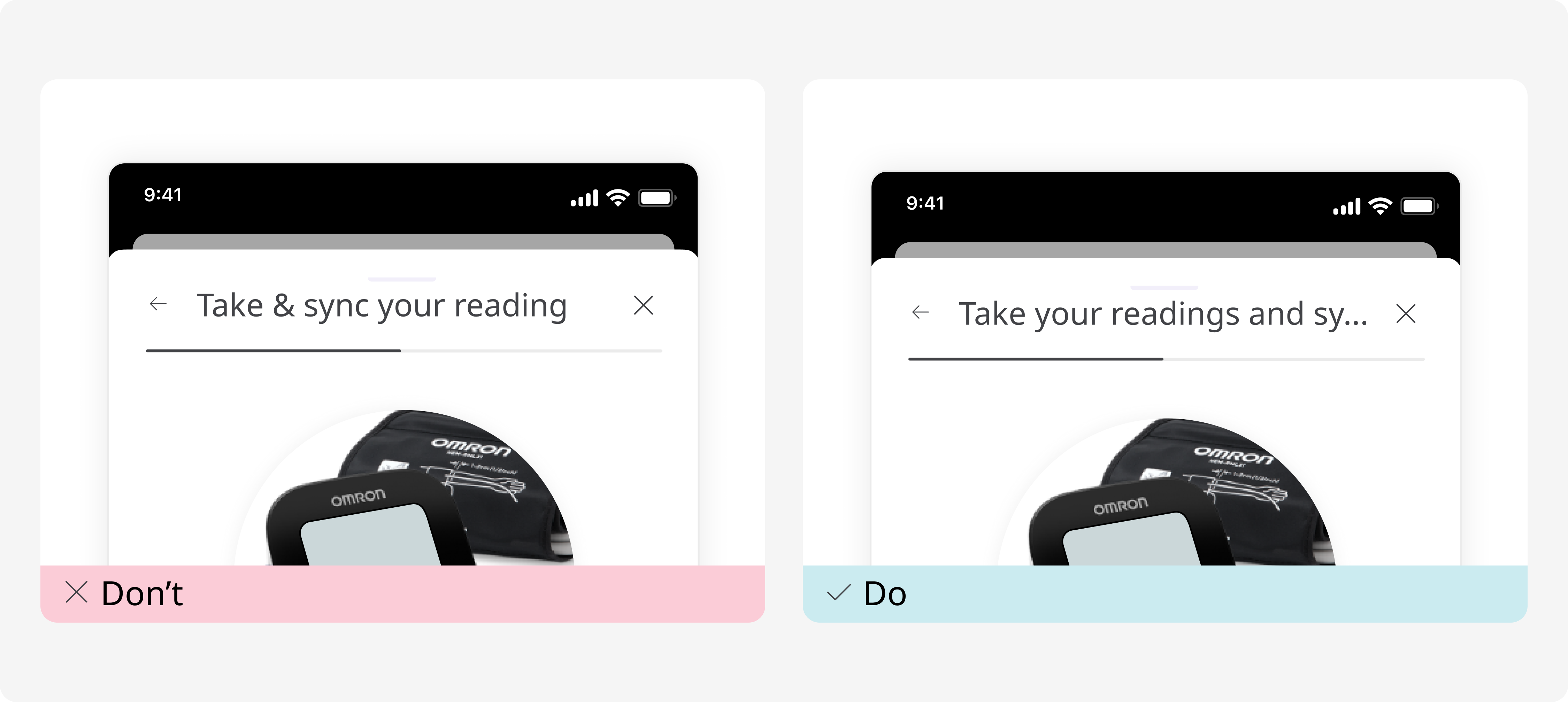
Header
The title is a concise text that highlights the most important information or step within a section.
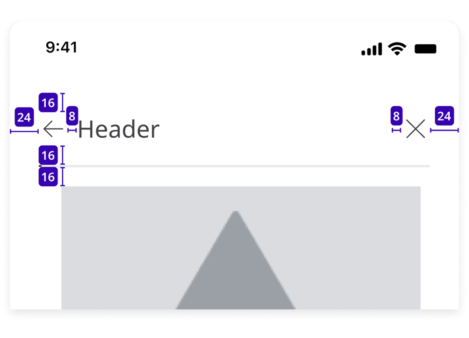
Purpose
To grab the user’s attention and provide clear context for what follows.
Guidline
- Use a maximum of 3-5 words.
- Avoid technical jargon; prioritize clarity.
Example
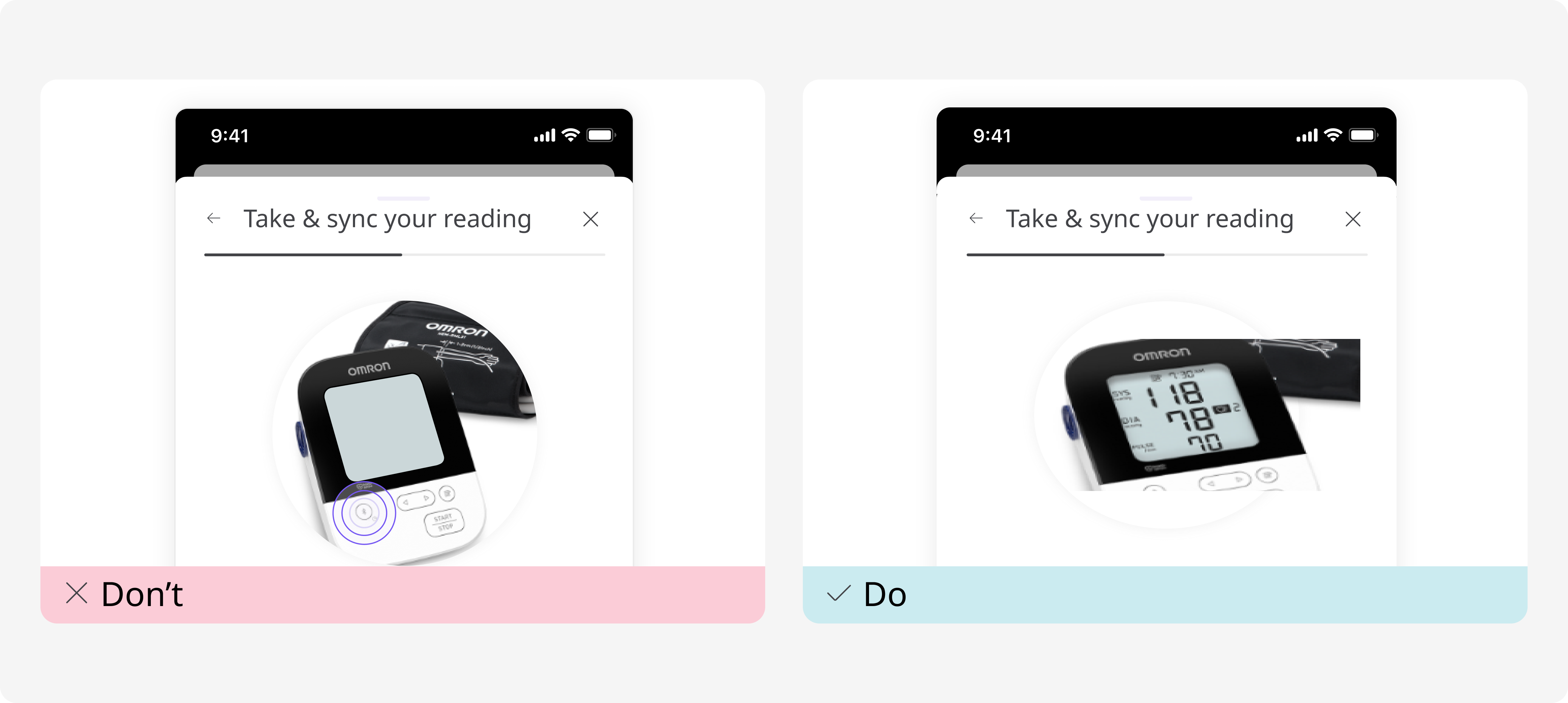
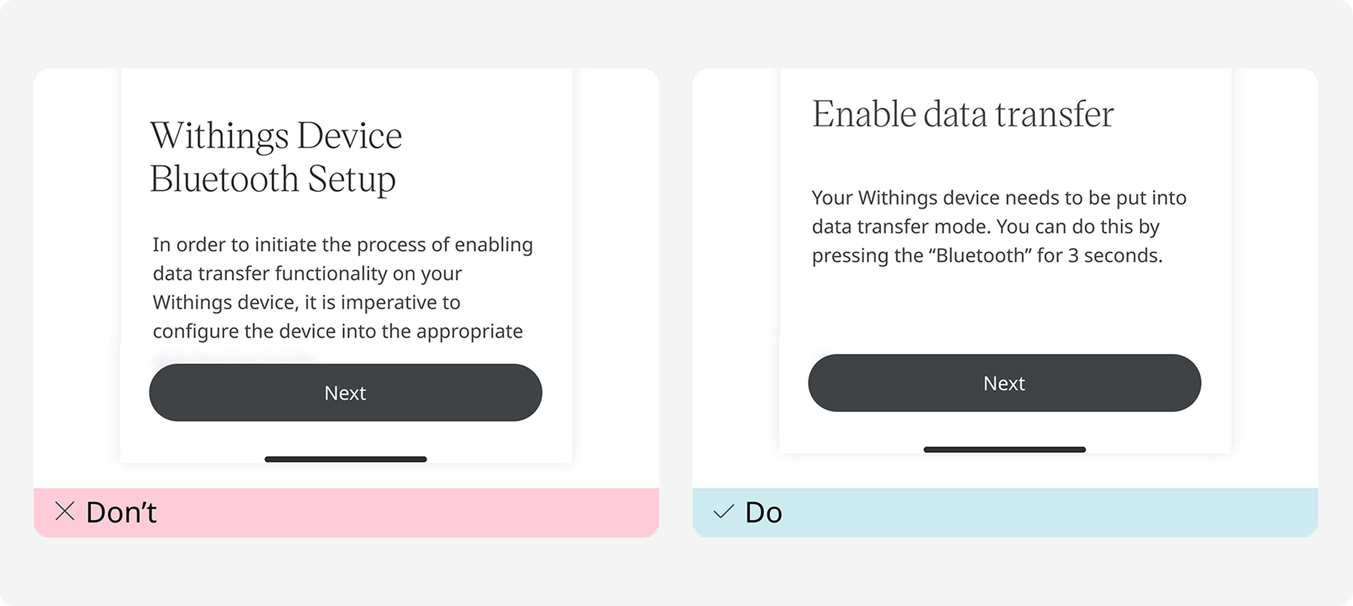
Image
A visual representation, such as a photo, illustration, or diagram, used to clarify concepts, demonstrate functionality, or provide context.
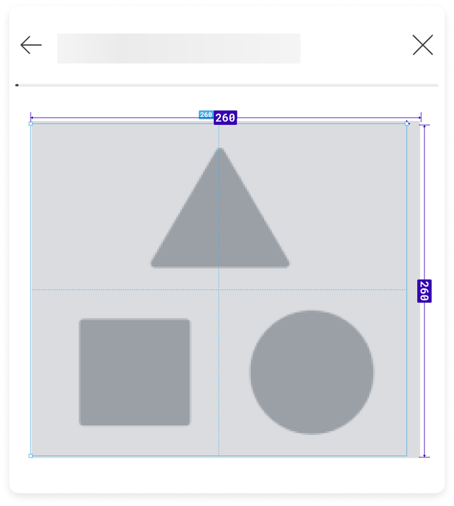
Purpose
To help users better understand instructions or information by showing the product or process in a clear and relatable way.
Guideline
Use high-resolution images for clarity.
Keep the visuals simple and focused on the key elements being explained.
Ensure images are responsive and accessible (e.g., provide alt text for screen readers).
Example
Title
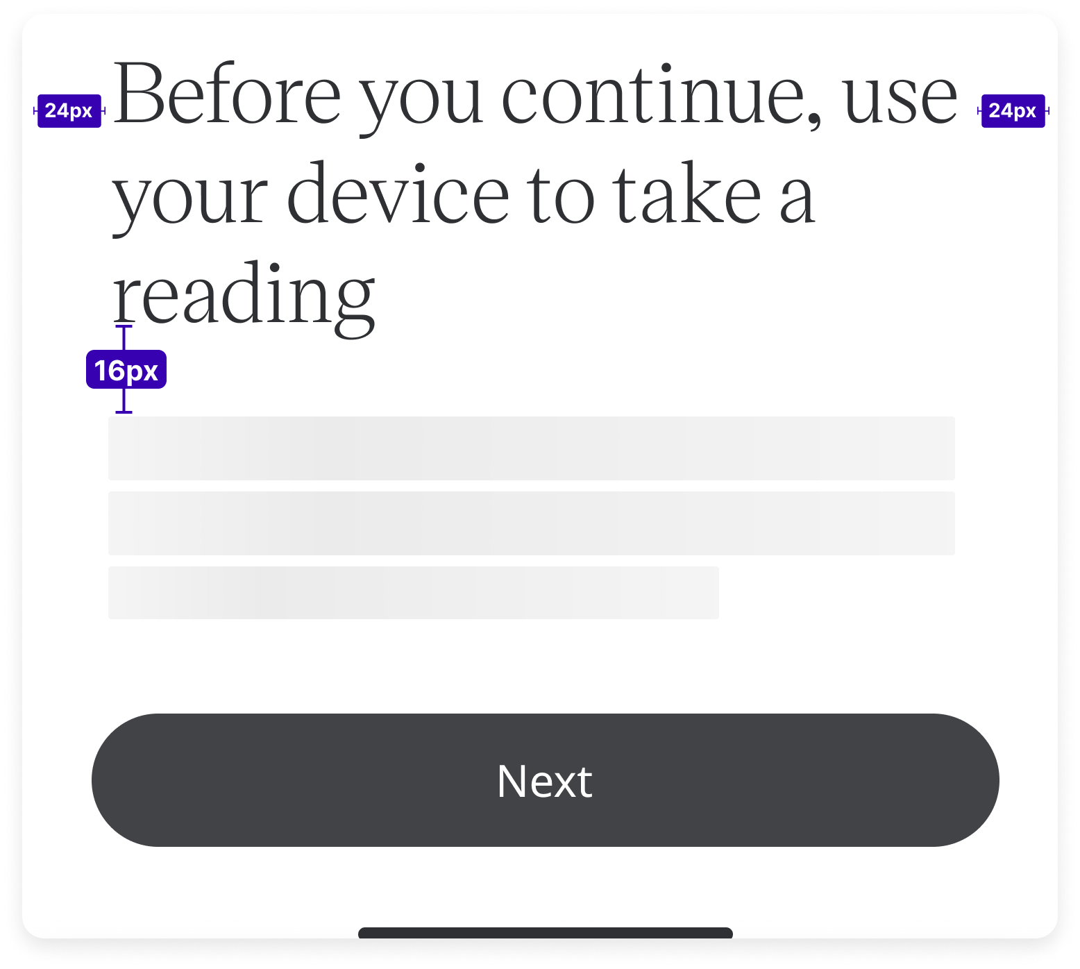
The title is a concise text that highlights the most important information or step within a section.
Purpose
To give users a quick summary or elaboration of the section's main idea.
Guideline
Limit to 1 sentence.
Use a slightly bigger font size than the body text for better visibility and emphasis.
Should not repeat the header verbatim.
Example
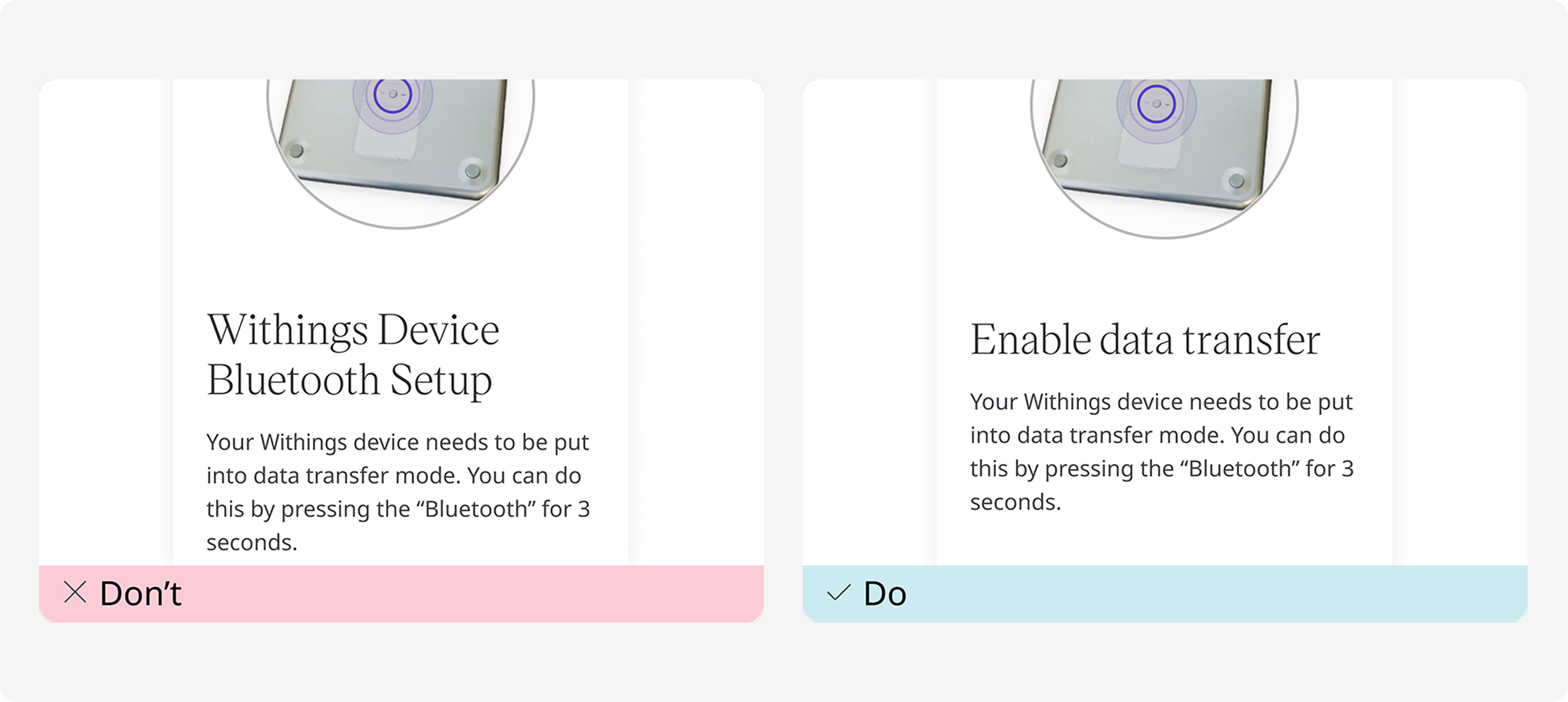
Body text
Body text refers to the main content used to provide detailed information, instructions, or descriptions within the interface. It typically supports the title and subtitle by elaborating on key points.
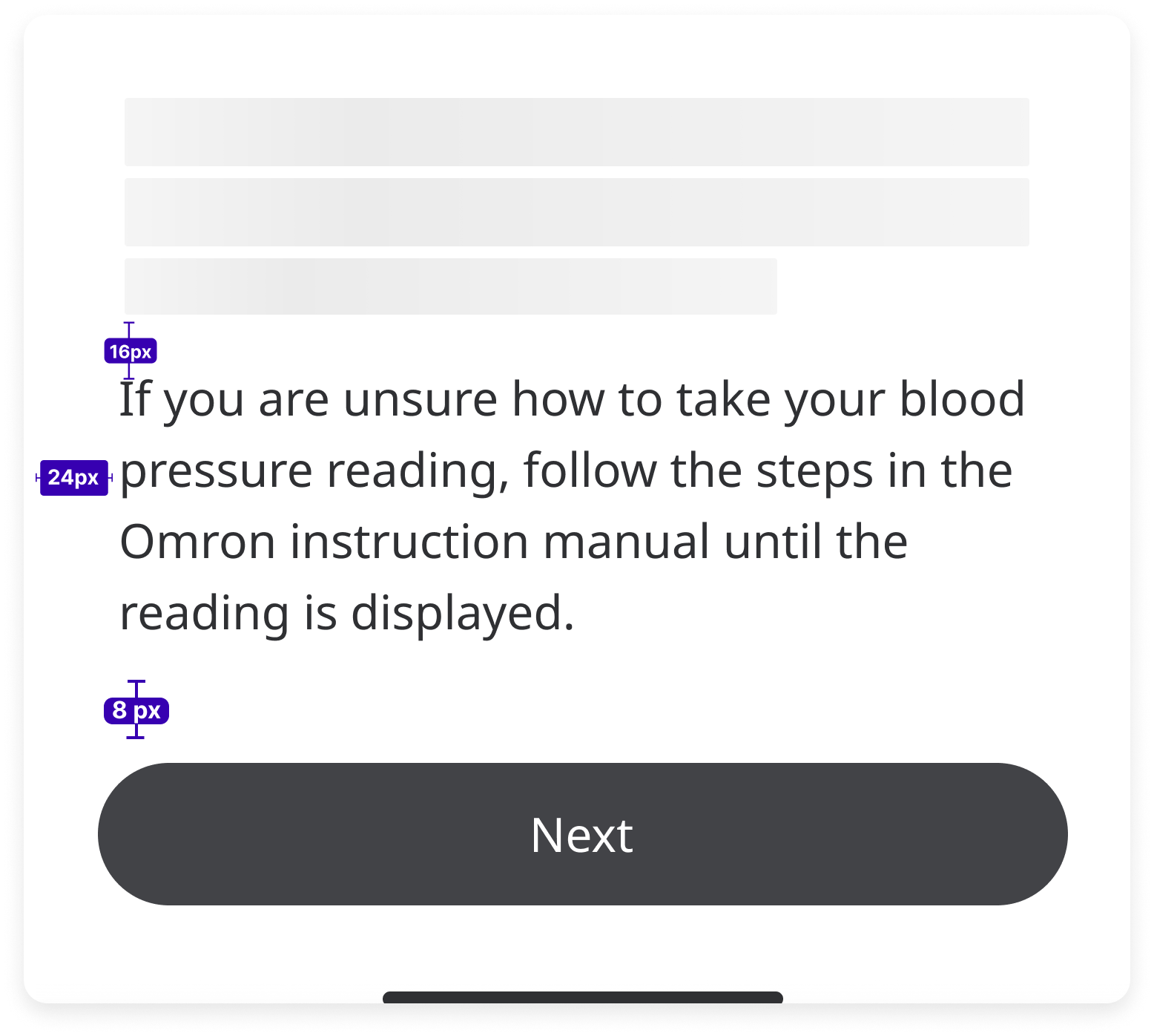
Purpose
To communicate clear, concise, and actionable information to the user.
Guideline
Use short, simple and straightforward language.
Avoid technical jargon unless it’s necessary and clearly explained.
Use a consistent tone and style throughout.
Example
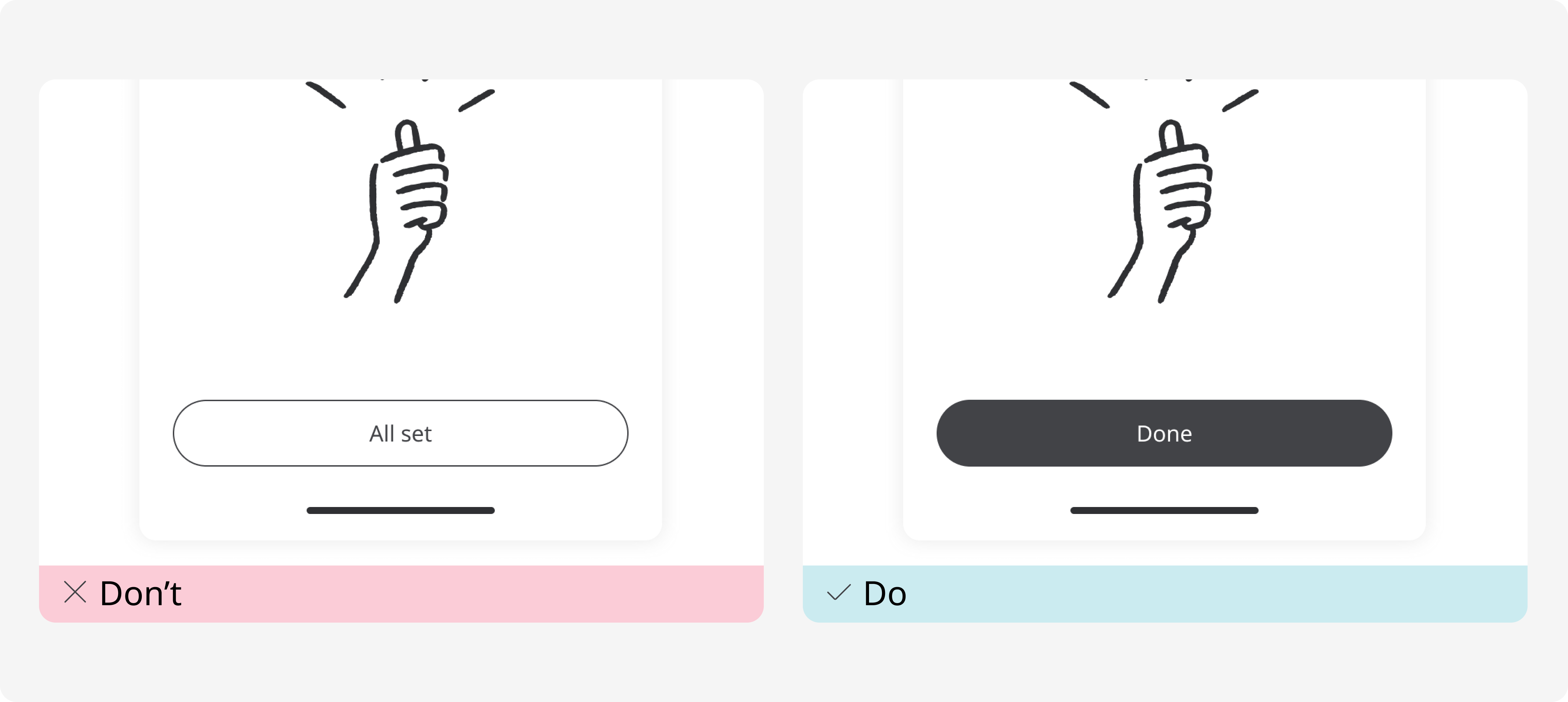
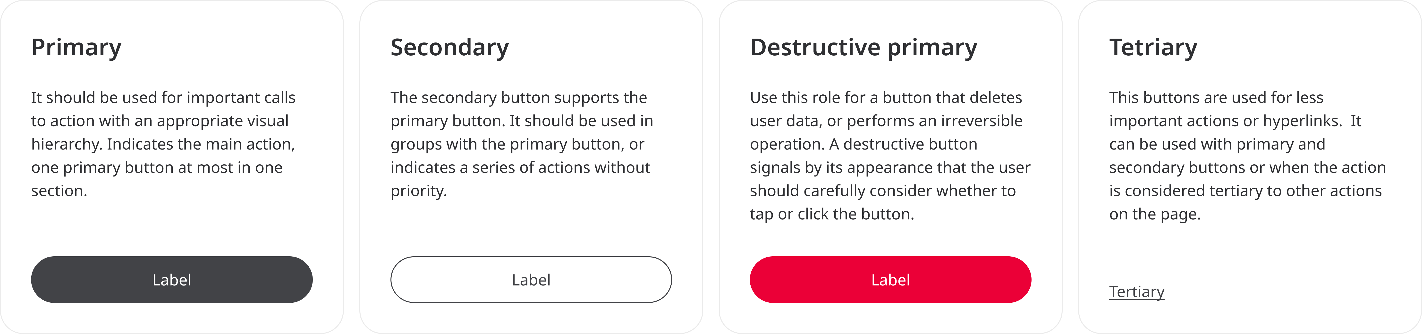
Button
Buttons are interactive UI elements used to trigger actions or navigate users to different parts of the interface. They are one of the primary ways users interact with the product.
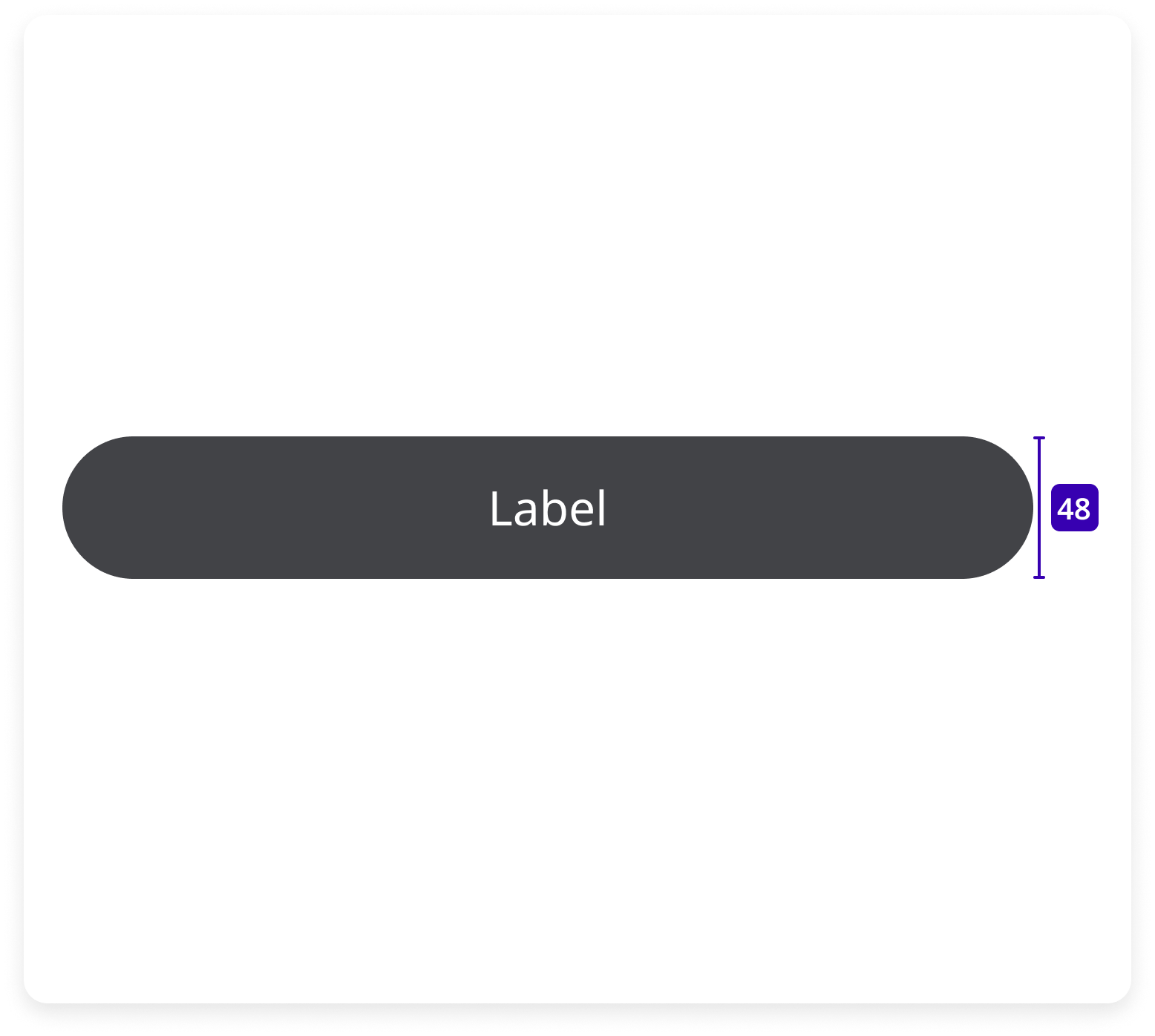
Purpose
To guide users towards completing key actions.
Guideline
Use concise, action-oriented text.
Avoid vague labels like "Click here" or "Do it."
Keep text short, ideally 1-3 words.
There are 4 types of buttons.
Example